
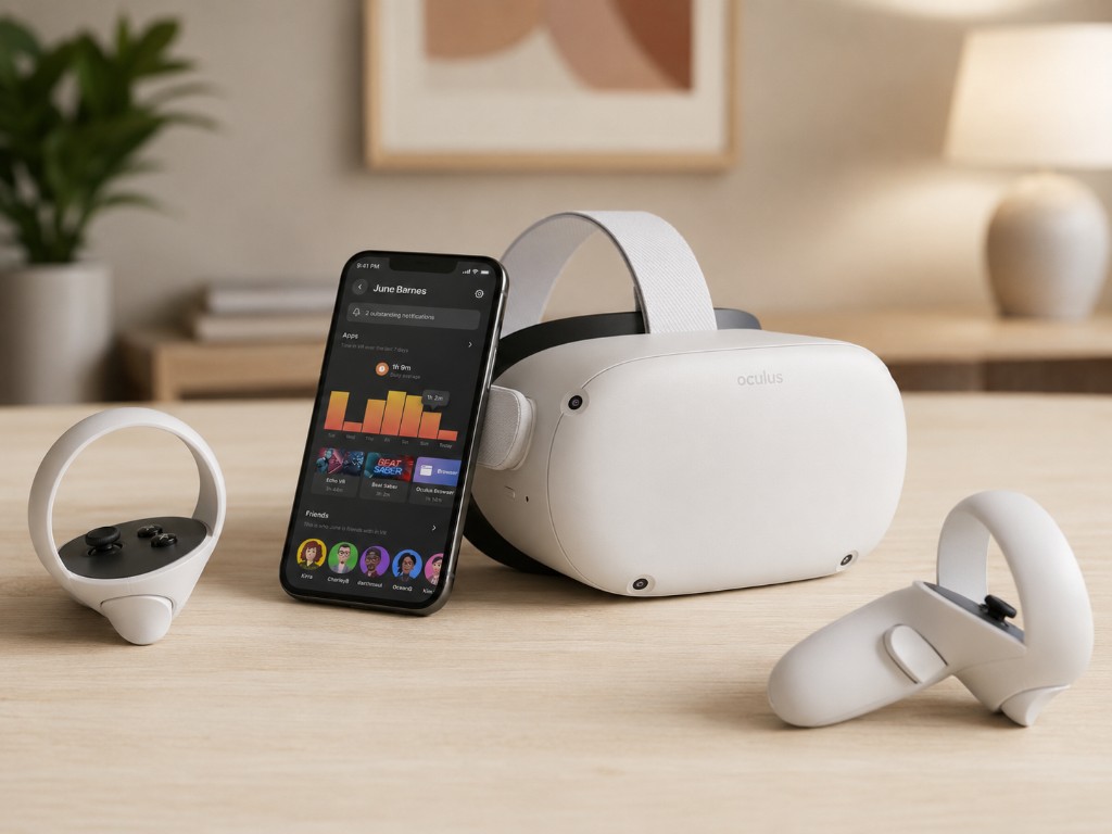
Parental supervision on Meta Quest
A teen is inside a headset. Their parent is on a phone. The product has to help them make decisions together without either side feeling confused, exposed, or stuck. Can this app be purchased? Should this browser be blocked? How much time have they spent in VR? Who are they connected to?
Today, Quest parental supervision is a full system: teen-initiated linking, parent consent, Ask to Buy, age-rated app blocking, parent-set app and browser blocks, time-in-VR visibility, and friend list visibility. It lives across headset, mobile, push notifications, payments, IARC ratings, accounts, profiles, and integrity systems.
I was the design DRI for the end-to-end product. I set the experience strategy, aligned product, policy, legal, privacy, integrity, and engineering, and held the interaction model across surfaces so parents could manage supervision from mobile while teens stayed inside VR.
App locking through the unlock pattern shipped first in spring 2022. The full Parent Dashboard followed in June alongside Meta's broader supervision work across Instagram, Facebook, Messenger, and Quest. Press covered the launch as the moment Meta gave families real controls for VR. The system is still live today, and millions of households use it monthly.


Multi-user and app sharing for Quest
A Quest rarely belongs to one person. It gets passed around. A partner trying VR for the first time. Someone taking another turn. A friend who wants to play Beat Saber for themselves. Until 2021, everyone shared one account, which meant shared saves, shared privacy, shared social graphs, and lost game progress.
Multi-user solved the identity problem. App sharing solved the economic one: people should not have to buy the same game twice just to have separate profiles. Under that simple expectation sat account isolation, entitlements, purchase rules, save data, privacy, lock patterns, mobile setup, and a fast in-VR account switch.
I led design for the end-to-end system, from research and competitive analysis through product definition and launch. The final product supported an admin, up to three additional users, separate game progress and social graphs, and a shared app library on one headset.
It launched in February 2021 as one of the most-requested features on the platform. Press framed it as the long-overdue unlock for sharing Quest at home. More people could play without losing progress or buying everything twice. It is still live today, used by millions of households, and remains one of the highest-loved features on Quest.


Unlocking video on Facebook Marketplace
Some things need to move. An engine turning over. A record player coming to life. A video can tell a buyer in seconds what a dozen photos cannot.
On Marketplace, that simple idea becomes a major integrity problem. More than a billion people use it each month, and listings are public by default. If any account can post a listing, any account can post a video. Prior attempts had stalled because no one had a clean answer for the abuse risk.
I reframed the product around trust: posting video was not a default right, it was an earned privilege. New accounts could not post video. Sellers earned access through a clean history of static listings. Audio ran through Meta's moderation pipeline for transcription review, and video was sampled frame by frame for inappropriate imagery.
I led the design strategy and took the model through Integrity, Privacy, and Policy, the approvals that had stopped every prior attempt. The result turned a long-blocked idea into a foundational Marketplace capability that teams have been building on ever since.

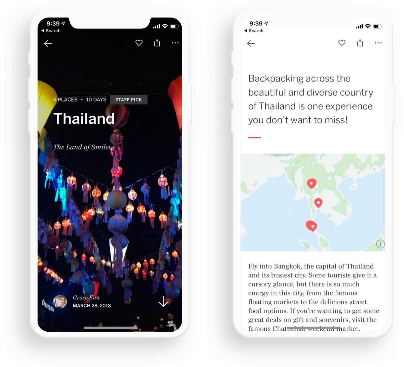
Reimagining Lonely Planet
Lonely Planet's flagship digital product needed to become more than a library of travel content. Destinations were the front door: continents, countries, and cities where most inbound traffic landed. Passive feedback through Usabilla showed people were getting frustrated trying to find core trip-planning information like top things to do, places to stay, and the best reasons to visit.
I led the product and design work across the new experience, balancing editorial inspiration with faster paths to useful information. We talked to users, tested layouts, and shipped a system that lifted engagement immediately and went on to win a People's Voice Webby Award.
The Lonely Planet Trips app
Trips by Lonely Planet started with a simple product bet: sharing a travel experience should feel almost effortless. Adoption depended on lowering the barrier to publishing, not asking people to write a perfect travel story from scratch.
We built an experience where people could upload photos and videos, and the app composed the trip for them using location data. It became a place for travelers to share, discover, and get inspired by the Lonely Planet community.

The Lonely Planet Guides app
Guides by Lonely Planet was built for the moment you arrive somewhere new and need fast, trusted help making decisions. The product had to feel calm, portable, and useful when someone was already on the ground.
With offline maps, currency conversion, and city guidance designed for real travel moments, Guides earned an Editor's Choice Award and was repeatedly featured on the App Store and Google Play.